Internet Professional Claim Submission (IPCS)
Role: Design Lead, Squad 11
Business requirements:
Lift-and-shift approach to refactor a legacy application, enhanced the user experience, and maintained identical business functions.
The user experience enhancements improved the user interface, streamline error messages, auto-populate user data, and implemented a new design system.
Design enhancements:
Claim Inquiry and Claim Submission merged one entry point, app and user experience
Recent claims are immediate available to view - removed search inquiry
Summary page formatted for print directly from application
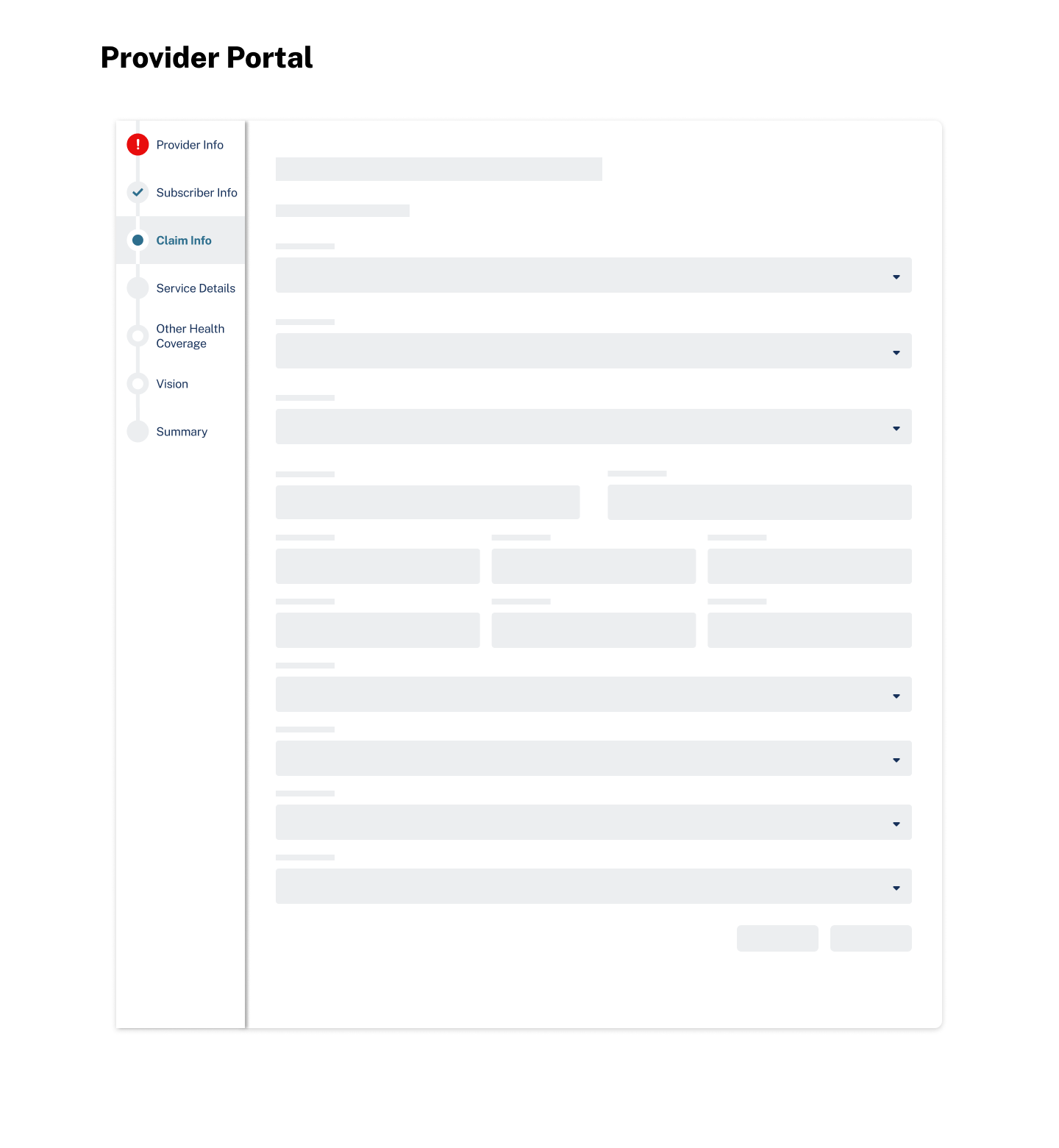
Step Indicator - icon aligned with action, user can navigate out of order
Field dependencies are responsive, showing required fields as the user enters information
Form that requires multiple entries is responsive and collapsable to allow the user to show entries in list view and edit quickly

Drove Enterprise
Design Thinking Workshops
The images are intentionally pixelated when enlarged to show the process but conceal confidential client details.

End-to-End Workshopping
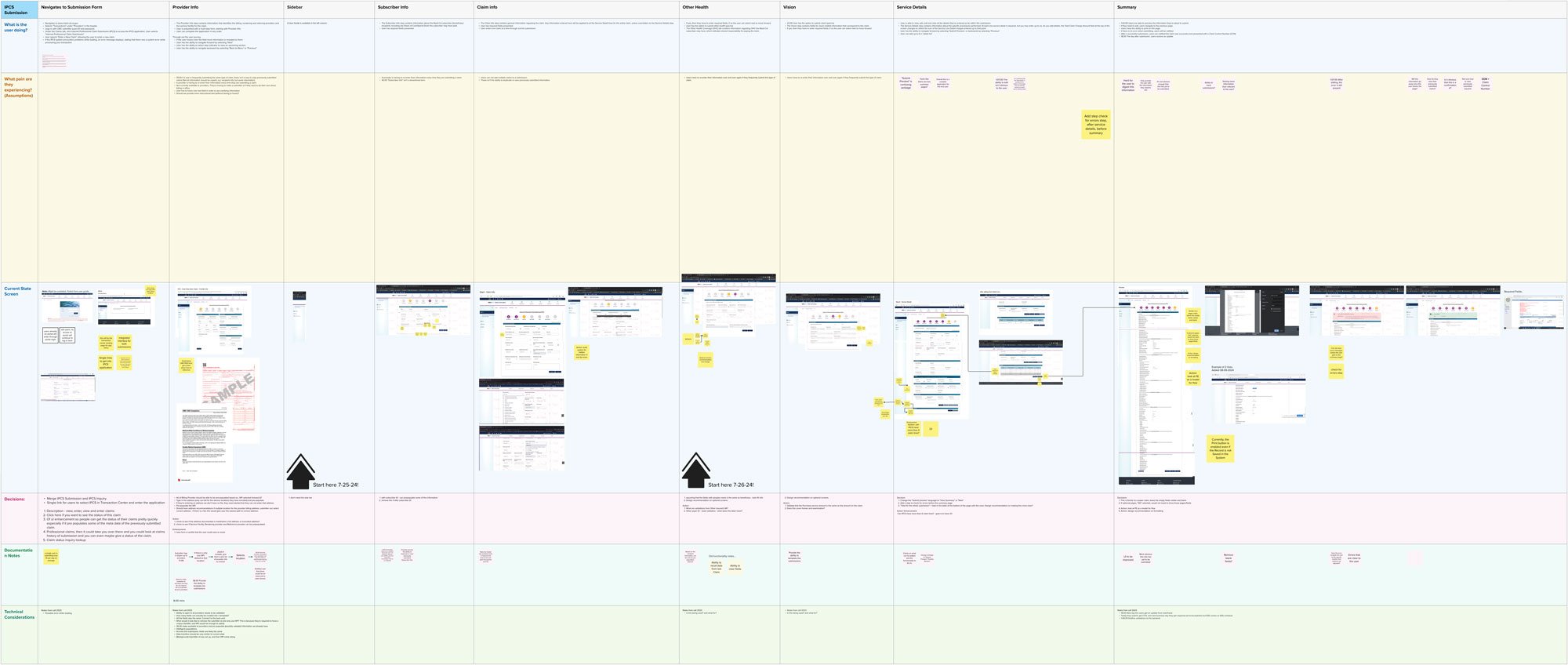
Current State, Future State

Flow Diagrams

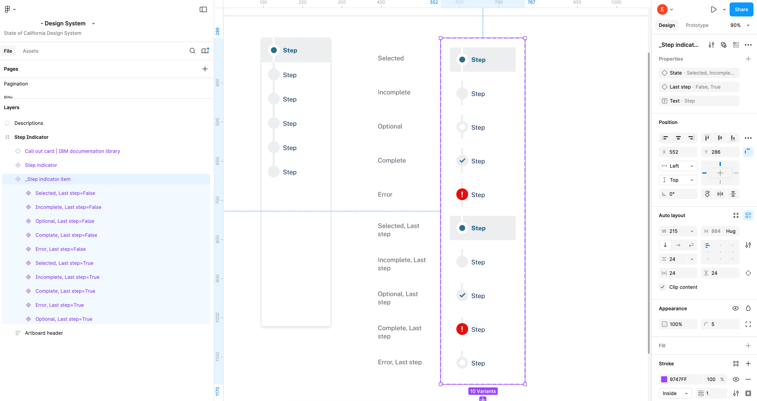
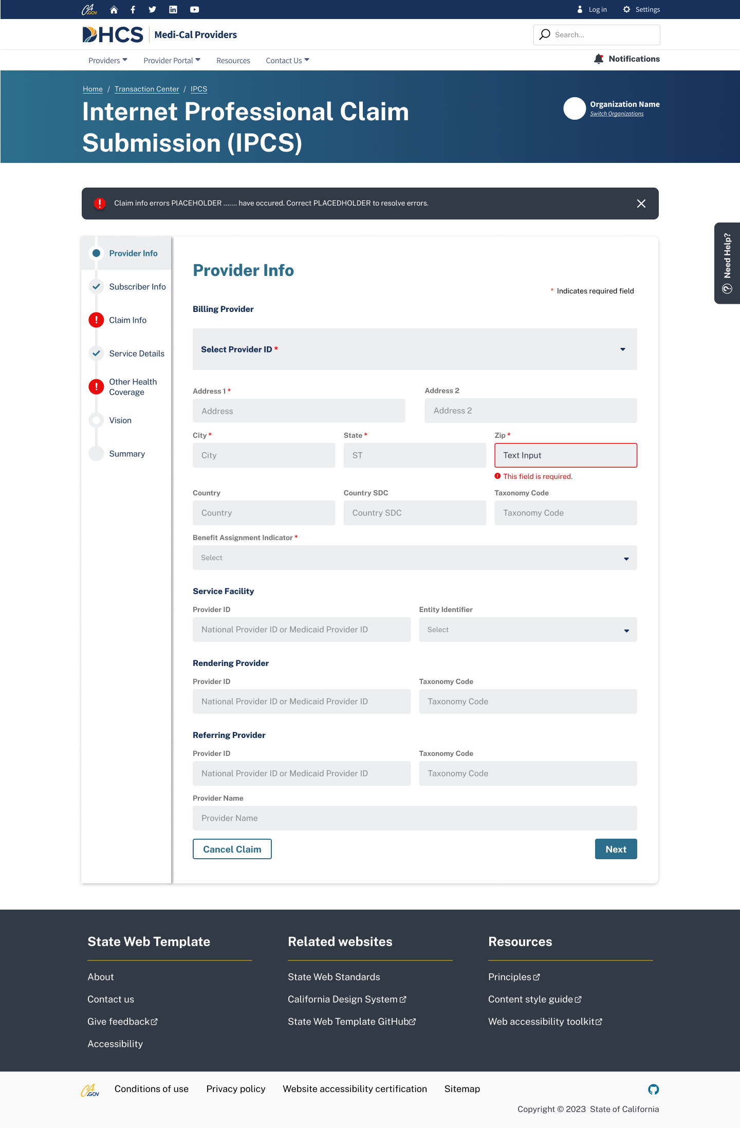
Step Indicator Enhancement
Problem Statement:
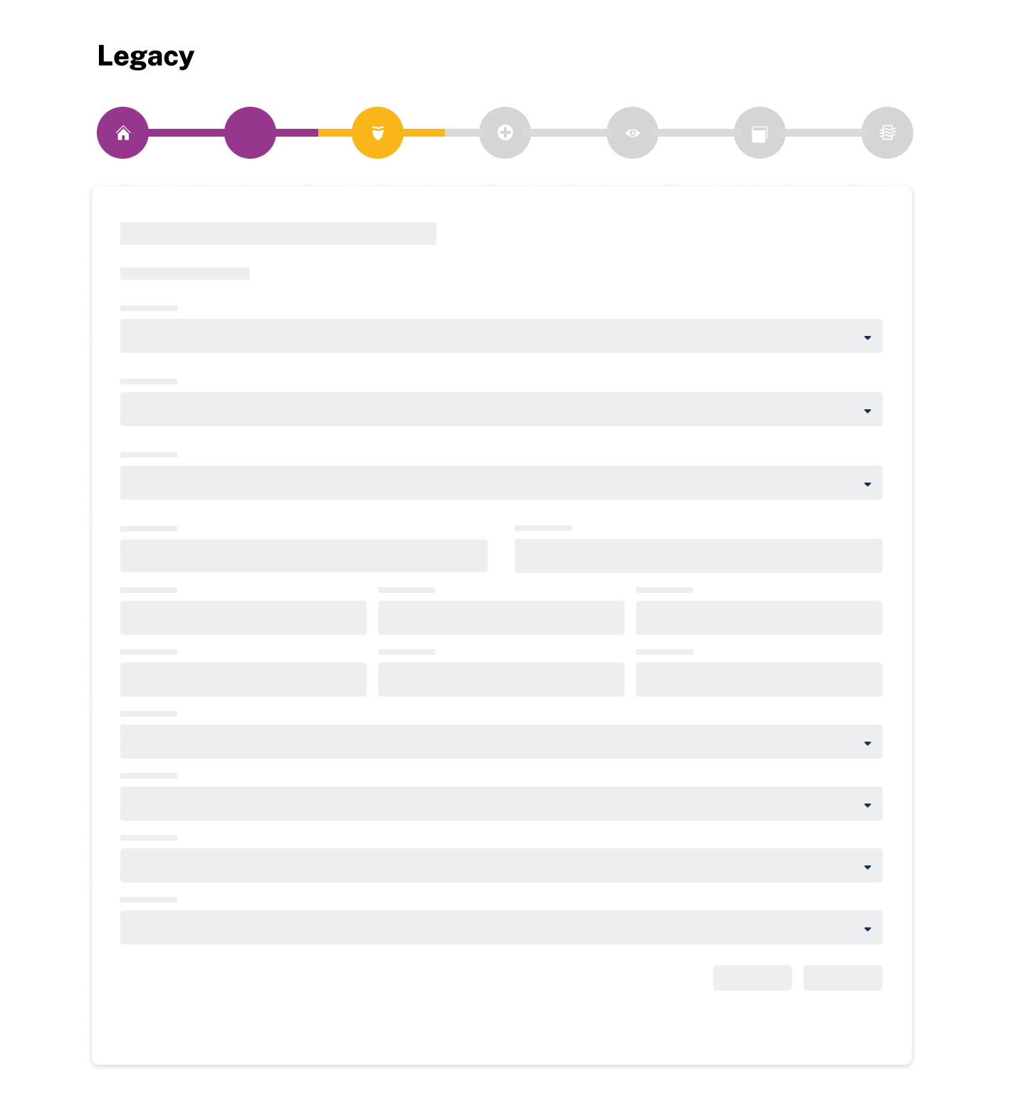
In the legacy application, the step indicator icons were illustrative of the page content. The icon colors changed and made it challenging for users to identify which step was currently in process.
Solution:
Icons were aligned with the actions, making them more intuitive and easier to understand.
The current step icon remained stable and did not change, providing users with a consistent visual cue.
Error icons were introduced to communicate front-end and mainframe validations, helping users troubleshoot errors more immediately.
Inactive indicators were added for optional steps that were skipped, allowing users to quickly identify completed tasks.
Success icons were introduced to celebrate successful completion of steps, reinforcing positive user behavior.
Steps stacked and left aligned, labeled to function as navigation.
Outcome:
The step indicator significantly improved the user experience by providing clearer visual cues and reducing confusion. Users could now easily identify the current step, troubleshoot errors, and celebrate successes.
Documented logic for errors and success when user navigates to a different step
Error (!) , front end validations
Error (!) when the user lands on a step and enters information in fields, then selects Next or a different strip in step navigation, the app runs front end validations, and the user is allowed to continue to the next step.
Validation errors
the step indicator will display an error (!) icon if errors
then when the user goes back to the step with errors, an alert banner will be displayed at the top the screen
and fields errors will display an error state, with alert message below the field stating the specific issue
Validation success
the step indicator will display a success (check mark) icon.
Created step indicator component in Figma